Anyone have the old logo?
I liked the dark theme, but wasnt a huge fan of the yellow and black…
Anyone have the old logo?
I liked the dark theme, but wasnt a huge fan of the yellow and black…
Gengis checking in
My input my logo and colour choice was the best, cant beat it /s
InshAllah you guys find something good, enjoy the stress of finding a
new logo and colours. I love dark themes, bright white for night owls
make the eyes hurt .
If you go to https://muslimgamer.com/mg/ it has the old old logo. Do you want the arcade one?
I have a copy of the arcade one if someone wants, stashed in the source code of Quest for the Royal Jelly.
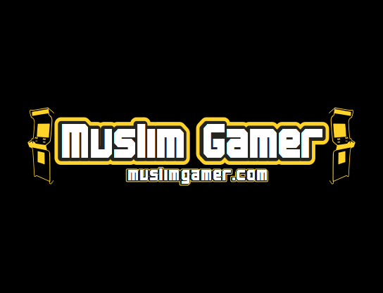
That one is an old old one too.
The final one didnt have both sides or the writing at the bottom.
Ill have to have a hunt around for the inkscape copy if you want the original?
I don’t mind funding a new one. $50 can get you a pretty decent logo. And, ya’ne, fiverr.com or whatever.
@muslimgamer let me know if you want me to go through with this.
im not falling for that @ashes99!!!
Im just here to cause trouble and delete servers when required. @abrarsyed @wulf and @ashes999 make the decisions.
It’s ultimately your brand and vision @muslimgamer . Don’t be one of those founders who walks away when things pass on to the new generation.
Anyway, whatever. If someone wants to pull the trigger on this, inshaAllah I will fund it and manage it.
ouch. reporting @ashes999, mods please ban.
In all honesty, ill be watching over but i fear holding things back, i have a vision which isnt fresh. Youre asking daddy to accept his child is growing up. Very hard to do. If it was up to me, id go with the old colour scheme because i still like it. I think its MG’s heritage. Logo can change though.
If i ever see anything that is against MG , il be sure to step in. But to grow and adapt, i have to let you guys take it forward 
but i liked my new name 
@ashes999, don’t hate the name T_T
Shhhhhh… its a secret
Disapears back into the shadows
I can work on a new design!
LOOOOOOOOOOOOOOOOOOOL
I love it!
@BloodMoney Thanks a lot for the time you put into this.
I had to think about this a bit, but here are my final thoughts;
What are you thinking of changing in the next iteration?
I don’t want to spoil the gem in the logo for anyone, so I’ll pm you further thoughts.
Figure
Anyone have an idea to make this hint at Islam?
I don’t know about you guys, but I think this is awesome.
Agreed that it’s awesome. Not sure about the hint though.
Maybe add a liwaa – that black flag with the kalimah on it – sticking out of the top? (But the detail would get lost in a small image.)
We already tried beards btw…


next up… hijab? LOL.
From what I understand, there are only 4 obvious symbols of islam…
I cant see a good way to integrate any of these into the current design. I think the discussion becomes whether or not we actually need any of these symbols, and instead can just rely on the text to say we are muslim.
Right! We’ll have to think about the implications of leaving out an Islamic symbol vs having one.
Aside: this is where something like a defined community vision will help us! Draft one of the rules and vision is coming up tonight, I’m expecting everyone to comment on it :3